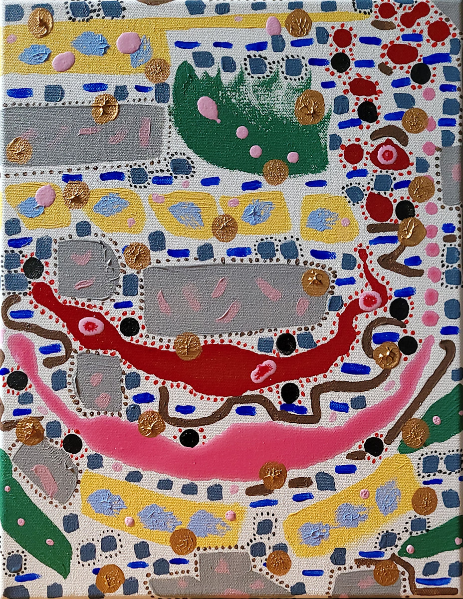
Back in the School of the Art Institute of Chicago, students studied color for a full year. Our final exam was meant to sort out how we can distinguish what our eyes see. It amounted to arranging hundreds of color squares according to intensity, saturation, hue and tone. The instructor came over to my exam process and commented, “I don’t know what you’re doing but it’s working.” I passed the test.
Years later I took a workshop on color for artists as a possible update and refresher. The workshop was sponsored by the Clackamas County Arts Alliance, held in Oregon City, and led by artist and educator Christine Hanlon. Part of me was assuming I knew everything, but I was unfamiliar with all the jazzy colors now available – luminescence, sparkle, pearlescent, neon, etc. – and recognize the potential for learning is a constant. Thankfully Christine Hanlon opened my eyes to a wider perspective about colors.
Color is also examined in a scientific measure of its attributes. It’s a phenomenon of light and is scrutinized for its refractive qualities and psychological impact. Also the University of North Carolina at Chapel Hill offers suggestions for creating web content that includes people dealing with specific blindness to color. See https://www.med.unc.edu/webguide/accessibility/color/.
Every functioning eye or eyes can recognize color. Keeping to the human realm, home decorators and fashion designers can be quite exacting in their choices. I assume all working 2D artists and crafts people give earnest consideration to color in some way with their work. It could be used as “reality,” or fantasy; as a subtle element, a bland monochromatic or jarring, harmonious blending of hues and fantastically significant or rather neglected. I use color as a quite significant tool, expressing a personal statement of understanding. And even though I work abstraction, for me it’s a realistic use.
Recently I had cataract surgery done on both eyes. The National Eye Institute (.gov) explains “Most cataracts happen because of normal changes in your eyes as you get older. When you’re young, the lens in your eye is clear. At around age 40, the proteins in the lens of your eye start to break down and clump together. This clump makes a cloudy area on your lens – known as a cataract. Aug. 24, 2023.” When the lens clouds, color perception is altered. When the lens is again clear, color perception again changes.
Also I noticed with my last new eyeglass prescription, the lenses have a slight green coloration due to an antireflective coating. (It is possible to remove this, so says Google, but I haven’t tried.) In the studio I use a clear magnified version of the regular eyeglasses. It allows me to see detail a bit easier. It also helps me think that I’m seeing truer color.
My husband Mickey, photographer, goes to great effort to match color to the original artwork. The digital camera does not do it on its own. So here at home coloration is fairly exact. But viewing on different monitors? Whatever a person views online, color will be affected by: 1.Their general perception of color; 2.Time of day and season; 3. Ambient light; 4.The monitor they’re using; 5.Their mood.; 6. Whether the person is rested or tired; 7. And all else that I fail to mention. The upshot is that I’m cautious about getting too picky with color choices.

