As a visual person and artist I rely on visual cues to understand, remember and express. For those not grounded in the visual, some of what art presents may be baffling, confusing or downright irritating.
Engaging with a work of art demands openness and critical thinking. All responses reflect the viewer’s state at that time. No response to an artwork is “wrong.” What the artist intends is not the “correct” response. This is particularly true with abstract art which freely lends itself to personal interpretation. That is its strength and challenge. Everything I present reflects some aspect of my humanity, personality and ever-evolving philosophy.
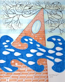
A narrative can be useful to further clarify a visual statement. The following describes the process and thought in my presentation of “Perseverance Furthers” (see above). The artwork’s title is lifted from the many I Ching references using that phrase.
I started the composition wanting to express how it feels to surmount something—how it feels to metaphorically climb that mountain, to come to an “Aha!” moment or resolution, to grasp a new learning possibility.
It would be impossible to describe all the nuances in this visual process, yet it may be helpful to analyze the compositional elements.
Visual Elements of “Perseverance Furthers” and their Philosophical Foundation
Brick-like Triangle. Represents the being in the process of surmounting. It extends upwards, always using foundational talents, perceptions and abilities (bricks).
The bricks themselves are not uniform and alter as they move upward. This represents change as one perseveres in a task or ideal. The topmost point recognizes a plateau. The oval opening reveals a surprising new truth (from the background) which lends itself to an ultimate resolution. The blues within the oval change direction, as needed by the triangle’s progress. Coloring is warm, personable, and includes white highlights.
Big Blue Shape. It functions to obscure and distract the process of unfolding or persevering. It appears to obstruct yet is necessary to the process. It is flowing, contains varied patterned forms that are familiar as raindrops, tears, and jewels. Its movement suggests a wave action: to/fro, one step forward/perhaps one back, the dance of enlightenment. Note that the bricks, though interrupted, continue upward; that is perseverance.
Light Blue(s) Background. That which is felt once the undertaking progresses. What allows resolution, comfort and a feeling of harmony; the underlying order of everything perhaps generated by a benevolent if indifferent power.
Black/gold Branches. Finally! A flourishing, growth, potential is realized. The branching forms echo the patterns found in veins (either blood in mammals or minerals in the earth), lightning, and of course, plant roots and tree branches. All of these echo a pattern indisputably necessary to life on earth. Black is used as a power color; gold represents something of value.
White spaces. The white in the blue form, among the bricks, and in the lower right corner pay tribute to the strength of that basic, certain fact that the earth supports all living things, all colors, all light and energy. The whole composition remains quite beauteous.
