
"Art does not reproduce what we see; rather, it makes us see."
Paul Klee
Paul Klee
Updated contact information: use 2025artmsr@gmail.com
2/26/2025 New Blog Post: "Changes"
See Just Saying: Mickey's Blog
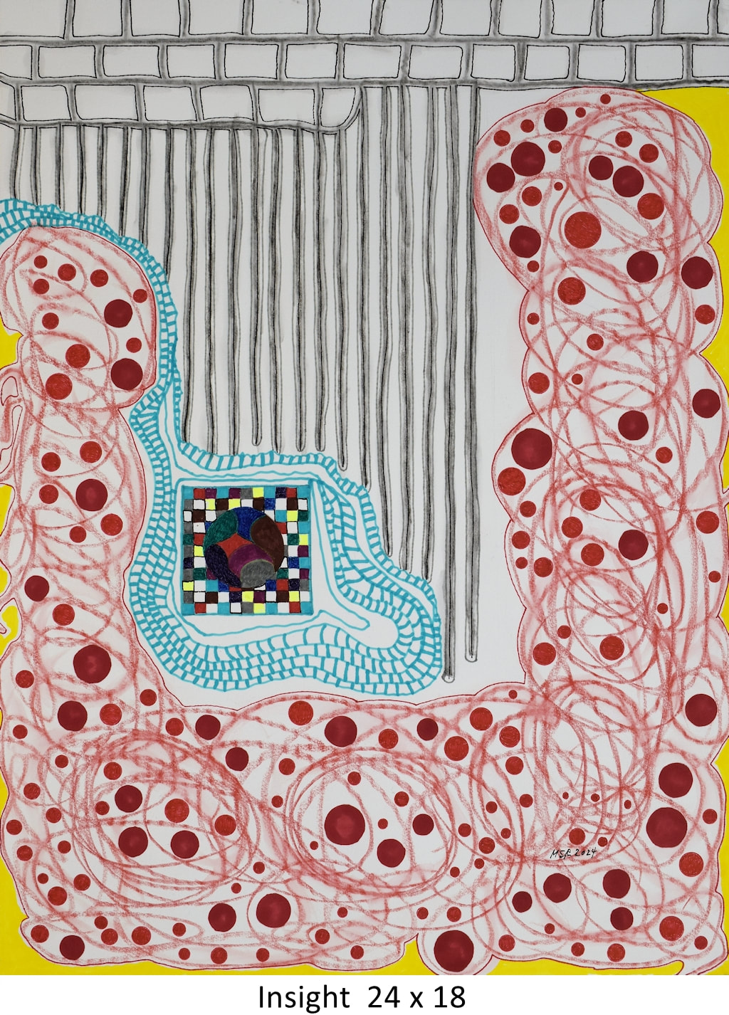
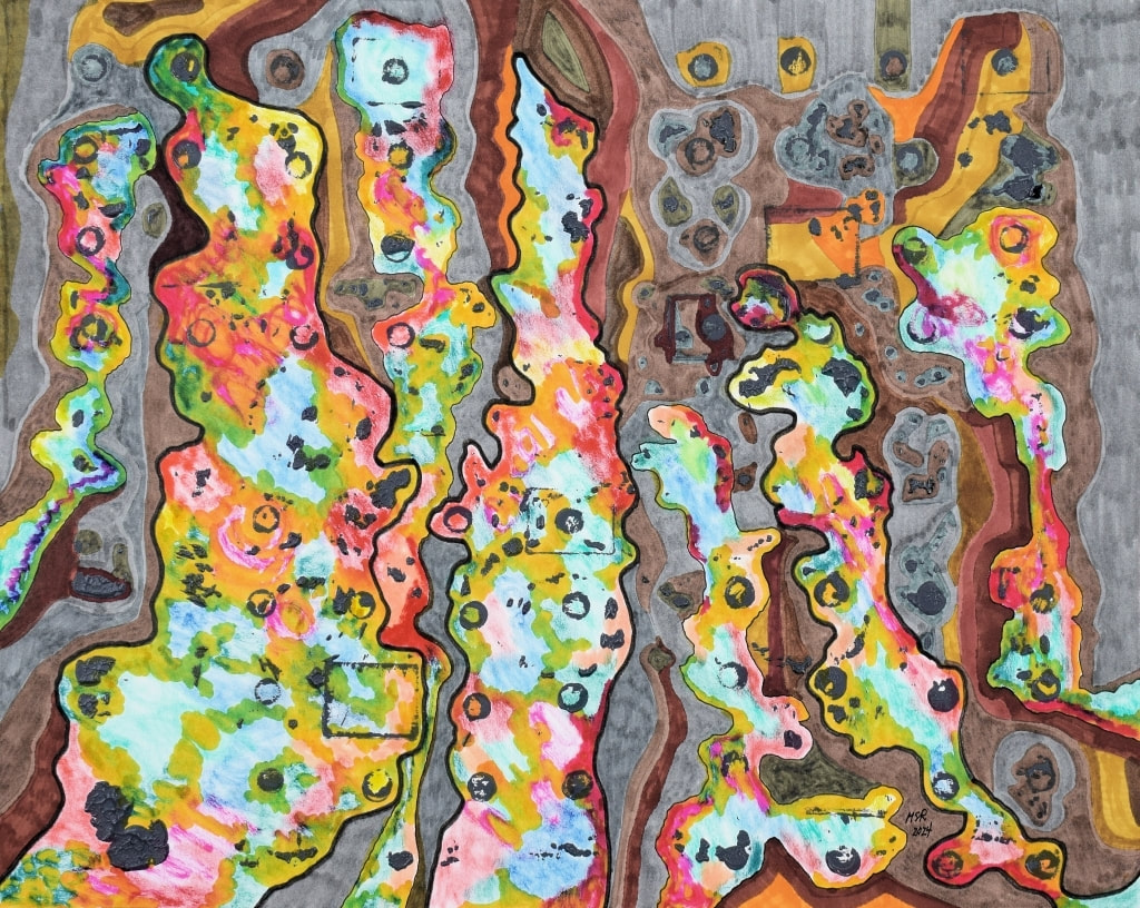
Insight. 24 x 18, Blick’s hot press, 140lb watercolor paper; watercolor stick, watercolor marker, Micron and gel pen. The final artwork for 2024. (2025 works coming soon.)
Inspired by repeat dream images giving the basic composition: energetic red moving up the sides, brick shapes line top, central vertical lines repeating. Basic composition represents life, the cosmos; inserted blue-outlined form represents us as a species—yet insulated from wider perceptions using limited senses, contained in our own atmosphere, maintaining connection.
Inspired by repeat dream images giving the basic composition: energetic red moving up the sides, brick shapes line top, central vertical lines repeating. Basic composition represents life, the cosmos; inserted blue-outlined form represents us as a species—yet insulated from wider perceptions using limited senses, contained in our own atmosphere, maintaining connection.
Studio Practice: New Works
Three Drawings and One Painting
November 2024
Images are presented full size. The caption announces title and dimensions given in inches, first height then width. With extreme thanks to Mr. Mickey for all photo images and tech assistance on this web site.
The Intersection of Contraries is inspired by artist Katherine Ace (1953-2023) who said, “The intersection of contraries fascinates me: life and death; humor and tragedy; beauty and corruption; natural and constructed realities; experience and news. I am captivated by complex issues that we all face, and yet experience personally, intimately. I am interested in the role of dark feelings, thoughts and states of mind in the process of transformation. I am drawn to fire beneath reserve.” This work takes effect on Arches 16 x 20 inch hot press 140lb watercolor paper using Micron pen, watercolor marker and colored pencil. For even more details see: http://artmsr.com/just-saying-mickeys-blog.html.

Perception is Controlled Hallucination is a work based on its idea that I find engaging. Google gives the philosophical AI Overview: The idea that perception is a controlled hallucination is a theory that suggests that what we perceive is a model of the world created by our brain, rather than the world itself. This theory is supported by the work of several thinkers, including: Claudio Paolucci … Argues that the imagination controls perception, which is the product of the imagination controlled by the world.” This work is presented on Arches 8 x 10 inch hot press 140lb watercolor paper using watercolor markers, colored pencil and Micron pen.

Disappointment #2: Hope Plunges. Disappointment is a feeling I addressed earlier this year too, as a simple statement. This time (#2) I wanted to acknowledge that disappointment doesn’t exist in isolation. It is typically preceded or accompanied by motivation, desire, hope and expectation. My composition is done on Arches 16 x 20 inch cold press 140lb watercolor paper. Media is similarly mixed: watercolor marker, colored pencil, InkTense and Micron pen.
An Element of Chaos. From English guitarist Jeff Beck (1944-2023) who said, “I like an element of chaos in music. That feeling is the best thing ever, as long as you don’t have too much of it.” This is expressed on a 20 x 16 inch canvas using acrylic paint.
"About that Artwork"
BONUS: A new tool for you—the index of 650 web site artworks with their back stories. File will be updated with new works periodically; introduced in June, 2024. Note: this tool will not be available after April, 2025.
As visitors have noted, we present the individual back stories with the presentation of New Artworks and then the stories disappear. Now you can find them again. Six-hundred and fifty artworks are given their personal stories in a 61-page WORD file called "About that Artwork."
THE LINK: https://www.dropbox.com/scl/fo/zl2ctp1zvxta0gs1dlzs6/ACEJRo_lRutETHADY6S0Qes?rlkey=b4zvxyk7vyyoovvy51ujdiacy&st=ilkoluh6&dl=0
You will find artworks indexed alphabetical by title. Year of completion follows in parentheses and then their back story. DATA specifies size in inches and materials used. Visit the on-site galleries and relevant year or Archives to rediscover the image.
Studio Practice: New Work, September 2024
Chaos Ascending, Order Descending, 16 x 20 inches on Arches hot press 140lb watercolor paper; acrylic paint, Micron pen, watercolor markers. Intuitive.
Some years ago I heard the idea that the universe is ruled by chaos. Being one who indulges in order, efficiency, and simplicity, it took awhile to develop a love for chaos. (Too many chaotic family episodes!) However, my current understanding is that chaos is the creative element and order is tradition: one extremely limited, the other fruitful.
Some years ago I heard the idea that the universe is ruled by chaos. Being one who indulges in order, efficiency, and simplicity, it took awhile to develop a love for chaos. (Too many chaotic family episodes!) However, my current understanding is that chaos is the creative element and order is tradition: one extremely limited, the other fruitful.
16 mm Film Work: Movies, Movies, Movies!
Back in the day when I attended the School of the Art Institute of Chicago on a full-tuition scholarship, I fell in love with film work. When the Chicago International Film Festival included a 60-second category depicting "The Condition of Man" it sounded perfect. This was a topic of deep consideration and this was something I could do within budget and with the 16 mm Bolex the school provided. Fortunately the Festival thought so too and my film "Popcorn" made it's premier at the 1970 Chicago International Film Festival.
The other two short clips are more exploratory and request that the viewer simply free associates with the images.
My husband, Mr. Mickey [yes, we have the same nickname], is the techie who made this Cloud link.
Thank you.
Popcorn
https://drive.google.com/file/d/1cCP7Iik9B-c9hyFPux43htCqY8hZi7mB/view?usp=sharing
Violence
https://drive.google.com/file/d/1hlmxqTBLpGNN0QFQRMbocvoHcK1VJrPG/view?usp=sharing
Footage
https://drive.google.com/file/d/1-8-plC6clXFHxJz8rg1BiUo50-t2koZP/view?usp=sharing
It's Here! The Mickey Moon Gallery
Photos of my early artworks are assembled and ready for viewing. Use GALLERIES above to go to The Moon Gallery.The images demonstrate early explorations into collage, relief (sand casting), sculpture, montage and figurative art. All artwork was done in the 1960s and early 70s.
A bit of Backstory: After high school graduation I spent the summer at the Ox-Bow School of Art in Saugatuck, Michigan. Ox-Bow is affiliated with the School of the Art Institute of Chicago and still offers amazing opportunities for study. I then did general studies, including art, at the community college and was inspired by a work/study opportunity in Europe. I worked in Switzerland and Belgium from February to October 1967. After receiving a full tuition scholarship from the Chicago Public School Art Society I graduated from the School of the Art Institute of Chicago in 1972.
A bit of Backstory: After high school graduation I spent the summer at the Ox-Bow School of Art in Saugatuck, Michigan. Ox-Bow is affiliated with the School of the Art Institute of Chicago and still offers amazing opportunities for study. I then did general studies, including art, at the community college and was inspired by a work/study opportunity in Europe. I worked in Switzerland and Belgium from February to October 1967. After receiving a full tuition scholarship from the Chicago Public School Art Society I graduated from the School of the Art Institute of Chicago in 1972.
Artist Statement
I investigate abstract experience. It is the wellspring of feeling and thought and establishes all one's memories. It's our experience of life and how we interact.
Visually my intention is to disrupt expectations and expand visual communication--its specific language. First viewing doesn't need to be pleasant or comprehensible yet delights in engagement. I believe such engagement--even if silent and non-verbal--advances a greater interior and exterior understanding of the whole of life and one's self. This is, I believe, what art can generate.
I enjoy the challenge of giving concrete form to things and ideas by abandoning representational tradition and translating such essentials using color, form, texture, and composition. Honoring those aspects directing one’s humanity and life course include a respect for humor and the restorative power of the meditative state.
Currently the materials I use to make such statements include archival paper, canvas, wood, pens, ink, colored pencil, watercolor pencil, pigment markers, acrylic paint and graphite. Pens offer a fine line element; markers are typically somewhat bolder and obstinate. Colored pencil and watercolor pencil offer specific textural differences, especially in how they interact with a paper surface. Ink may allow a wondrous drip or not. Paint provides solidity and the ability to change direction.
While composition establishes the relative dynamic, color establishes the energizing force. Form emerges by differentiation from background. Texture is presented primarily through choice of materials, then through repetitive marks or patterning.
I often begin an artwork with a question or inspiring phrase and answer or respond in visual terms. What expresses the joy in a Home Depot experience or the strength in diversity? What is the attraction to danger or repetitive dots and dashes? When disorder is the universe's rule, do clarity and order relate? Why is it difficult to understand and accept we are each unique? And that fact establishes a universal connection.
My ideal viewer and collector responds by investigating the statement presented by the art. The activity necessarily becomes a mutual exchange. My art is not meant to offer a beauteous grope or meet current market demands. An appreciation of color, mystery, play, adventure, humor, a sense of self, and acceptance may all further a rich exchange. I encourage viewers to wander and safely embrace the language of my art and what it's saying. Welcome fellow travelers….